

Call center teams generate plenty of data, but that does not always mean they have clear visibility. If managers cannot see queue spikes, service risks, or agent performance in real time, they end up reacting late. That leads to slower decisions, inconsistent coaching, and avoidable customer frustration.
This guide explains call center dashboard software in plain English. It covers the core features, essential KPIs, practical use cases, software options, and buying criteria that matter most when you are comparing tools.
What Is Call Center Dashboard Software?
A simple definition for non-technical buyers
Call center dashboard software is a tool that turns live and historical contact center data into visual dashboards. It helps managers, supervisors, and agents track performance without relying on manual spreadsheets or delayed reports.
You may also see similar terms such as call center dashboard, contact center dashboard software, or call center analytics software.
It typically tracks:
- Queue health, such as wait times and abandonment.
- Agent activity, such as availability and handle time.
- Service performance, such as service level and response speed.
- Customer outcomes, such as CSAT and first contact resolution.
- Volume trends, such as peak hours and channel mix.
How it works in day-to-day operations
In daily operations, the software pulls data from your phone system, CRM, help desk, and often your CCaaS platform (Contact Center as a Service, meaning cloud-based contact center software). It then displays that data in one place so teams can monitor live conditions and review trends over time.
A supervisor does not need to dig through several tools. They can open one dashboard and see whether wait times are rising, which agents are available, and whether service levels are slipping.
A simple workflow looks like this:
- Data comes in from calls, queues, agents, CRM records, and support systems.
- The dashboard visualizes it through charts, widgets, and KPI cards.
- A manager spots issues such as a queue backlog or an increase in missed calls.
- The team takes action by reassigning agents, adjusting priorities, or coaching specific reps.
Example: if inbound wait times spike at noon, a supervisor can move agents from offline tasks back to the queue before the issue gets worse.
Call center dashboard software vs basic reporting tools
A basic reporting tool usually shows what happened after the fact. A dashboard helps you see what is happening now and act on it.
| Category | Call Center Dashboard Software | Basic Reporting Tools |
|---|---|---|
| Data timing | Live or near real-time | Usually delayed |
| Main purpose | Monitor and act | Review and summarize |
| Format | Visual widgets, alerts, wallboards | Static exports, spreadsheets, PDFs |
| Best for | Queue management, service risks, live staffing | Weekly reviews, historical summaries |
| Decision speed | Fast | Slower |
| User experience | Easier for day-to-day operations | Often more manual |
If your team updates spreadsheets once a day, that may be enough for monthly reviews. It is not enough for managing active queues, live service levels, or same-shift staffing decisions.
Call center dashboard software vs performance management software
Dashboard software focuses on visibility. It helps teams track KPIs, queue health, and agent activity.
Performance management software is broader. It may include:
- Coaching workflows
- QA (quality assurance)
- WFM (workforce management, meaning staffing and scheduling)
- Gamification
- Performance scorecards
Some tools overlap. But in simple terms:
- Dashboard software helps you see performance.
- Performance management software helps you improve it through structured workflows.
Why Teams Use Call Center Dashboard Software
Limited real-time visibility is a common operational problem
Many teams have data, but not enough live visibility. Managers may not know a queue is backing up until customers have already waited too long. They may also miss early signs of overloaded agents, missed calls, or service level drops.
This gets worse during peak periods. A morning spike or product issue can overwhelm a queue in minutes. If managers only review reports later, the problem is already over and the damage is done.
A real-time call center dashboard solves this by showing queue status, call activity, and service risks as they happen.
Manual reporting slows down decisions
Manual reporting creates friction. Teams export CSV files, clean spreadsheets, compare sources, and rebuild the same charts every week. That takes time and often delays decisions.
Common bottlenecks include:
- Exporting data from several systems
- Cleaning inconsistent fields
- Updating KPI trackers by hand
- Building the same weekly reports repeatedly
- Reconciling numbers that do not match
A dashboard reduces that lag. Managers can open one view and act on current data instead of waiting for end-of-day reports. AI can help automate summaries, but clean dashboard data matters first.
Coaching is harder without clear performance data
Coaching works better when it is based on patterns, not guesswork. Supervisors need to know whether an agent struggles with long wrap-up time, low first call resolution, missed follow-ups, or repeated customer complaints.
A useful dashboard gives managers objective performance data they can use in 1:1 sessions.
Example: a team might assume low CSAT is caused by long handle times. But dashboard trends may show the real problem is low FCR, which points to training gaps or poor handoff processes.
That kind of visibility makes coaching more specific and more fair.
Disconnected systems create data silos
Phone systems, CRMs, help desks, QA tools, and WFM tools often store different pieces of the same story. When those systems are disconnected, teams end up with conflicting reports.
Common signs of data silos:
- Sales and support report different call counts
- CRM activity does not match phone logs
- Queue metrics live in one tool while CSAT lives in another
- Managers rely on several dashboards to get one answer
Good dashboard software brings that visibility together. It becomes a more unified operational view, even if it is not the only tool in your stack.
Better visibility helps improve customer experience
Dashboards do more than improve internal reporting. They also help teams improve customer outcomes.
When managers can see service issues early, they can protect the customer experience faster.
- Long queue times can signal staffing problems before abandonment rises.
- Low FCR can reveal process or training issues that cause repeat contacts.
- Falling CSAT can show service inconsistency across shifts.
- Missed calls can highlight gaps in coverage or routing.
Better visibility leads to faster fixes, more consistent service, and fewer poor customer experiences.
Core Features to Look For in Call Center Dashboard Software
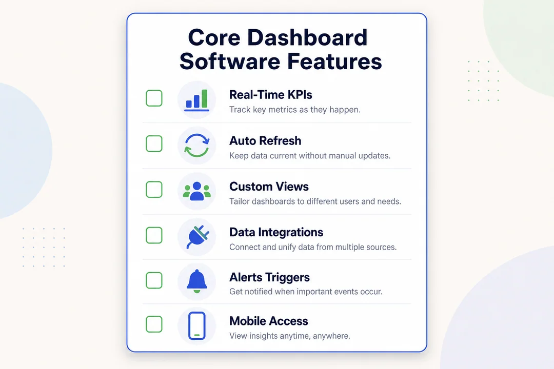
Real-time monitoring for calls, queues, and agent status
This is the first feature most teams should validate. If the dashboard cannot show what is happening now, it will not help much during live operations.
Look for:
- Live queue visibility
- Current wait times
- Active, available, and offline agent status
- Service level tracking
- Missed and abandoned call monitoring
- Threshold-based alerts
This feature matters because it supports live action. A supervisor should be able to see rising queue pressure and respond before service breaks.
Historical reporting and trend analysis
Real-time data helps with immediate action. Historical reporting helps with planning.
You need trend analysis to answer questions like:
- Which hours are consistently busiest?
- Which teams improve or decline over time?
- Are Mondays causing recurring queue pressure?
- Is staffing aligned to actual demand?
Good historical reporting supports post-shift reviews, workforce planning, and longer-term coaching. Without it, teams may solve today’s problem but repeat it next week.
Custom dashboards and KPI widgets
Different roles care about different metrics. A support manager may care about ASA and FCR. A sales manager may focus on connect rate and call outcomes.
Custom dashboards help each role see the right KPIs without clutter.
Examples:
- Support lead: ASA, abandonment, FCR, CSAT
- Sales lead: connect rate, activity volume, outcome rate
- Supervisor: queue status, agent availability, service level
- Executive: trend summaries, productivity, customer outcomes
The best dashboards keep views simple. More widgets do not always mean better insight.
Alerts and notifications for service issues
Alerts matter when they support action. They help teams respond to service issues before they become major problems.
Useful alerts include:
- SLA risk alerts when response times slip
- Queue overflow warnings
- Abandonment spikes
- Long hold time notifications
- Sudden drops in agent availability
One caution: too many alerts create noise. Set thresholds carefully so the team only gets notified when action is actually needed.
CRM, help desk, and business tool integrations
Integrations improve reporting quality and context. They help tie call activity to customer records, tickets, outcomes, and workforce data.
Key integration areas to check:
- CRM for account and deal context
- Help desk for ticket status and support history
- CCaaS for routing and interaction data
- QA tools for evaluation data
- WFM for staffing and scheduling
- BI tools if your team needs broader reporting
Verify whether integrations are native, limited, or paid add-ons. That detail can change the real value of a platform.
Omnichannel monitoring beyond voice calls
Many teams no longer handle voice only. They also manage chat, email, SMS, and social channels.
A useful dashboard should reflect that full workload, especially for blended teams.
Common channels to support:
- Voice
- Live chat
- SMS
- Social messaging
If the dashboard only shows calls, it may miss important workload and service context across the customer journey.
AI-powered analytics and automation
AI features are increasingly common, but they vary a lot by vendor and package.
Useful AI-powered features may include:
- Speech analytics that detect topics, keywords, or patterns in calls
- Text analytics for chat and email interactions
- Sentiment analysis that estimates tone and frustration
- Automated summaries for faster review
- Predictive alerts for likely service issues
- Next-best-action suggestions that recommend what managers should do next
Why it matters:
- It reduces manual review time.
- It helps surface hidden patterns.
- It can improve coaching speed.
- It supports faster triage during high-volume periods.
One caution: AI should not distract from the basics. If real-time visibility, metric accuracy, and usability are weak, advanced AI will not fix the underlying problem.
Role-based visibility for agents, supervisors, and executives
Not everyone needs the same dashboard.
- Agents need personal metrics, schedules, and status visibility.
- Supervisors need queue health, alerts, and coaching data.
- Executives need high-level trends, team comparisons, and customer outcomes.
Role-based views keep dashboards relevant and easier to use.
Essential Call Center Dashboard Metrics to Track
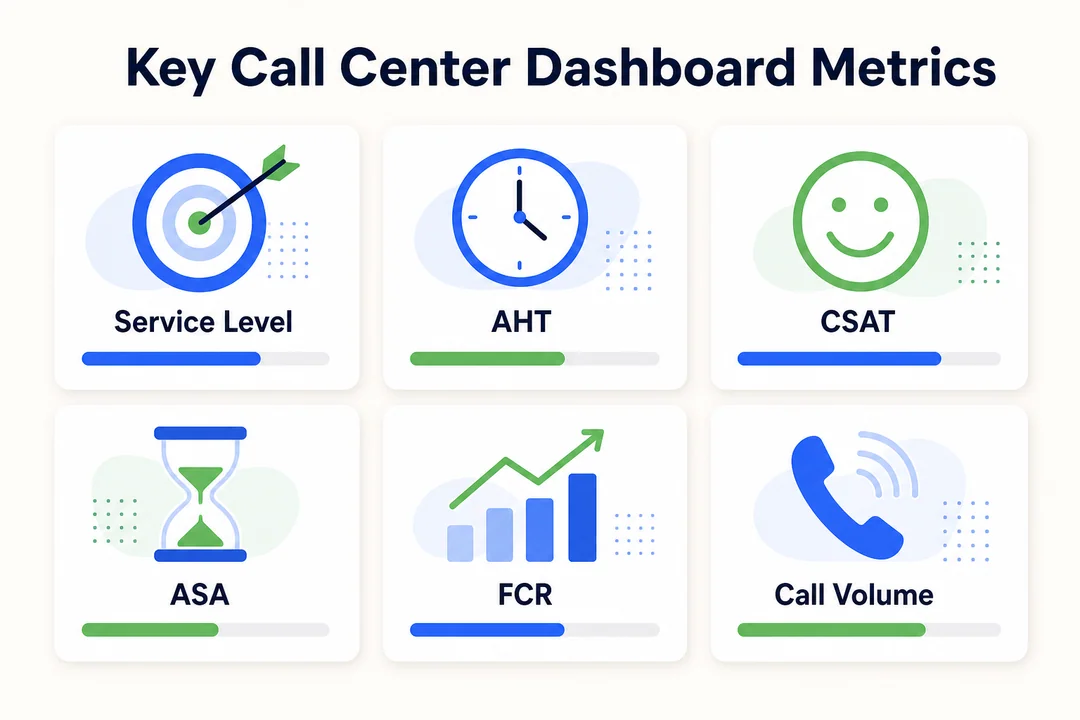
Response and queue metrics
These metrics show how quickly your team responds and how healthy the queue is.
| Metric | Definition | Why it matters |
|---|---|---|
| ASA | Average Speed to Answer, the average time callers wait before an agent answers | Shows response speed |
| Queue time | Time customers spend waiting in line | Helps spot delays and bottlenecks |
| Abandonment rate | Percentage of callers who hang up before reaching an agent | Signals poor wait experience |
| Service level | Percentage of contacts answered within a set target | Measures whether the team meets expectations |
| Average time to answer | Similar to ASA, often used interchangeably depending on platform | Useful for live queue management |
Interpret these metrics in context. A short queue time means little if call volume is unusually low. Always read queue metrics alongside demand.
Agent efficiency metrics
These metrics help teams understand productivity and workload.
| Metric | Definition | Why it matters |
|---|---|---|
| AHT | Average Handle Time, including talk and after-call work | Helps measure handling efficiency |
| Wrap-up time | Time spent after the call completing notes or tasks | Shows post-call process efficiency |
| Occupancy | Percentage of time agents spend handling or preparing for contacts | Helps assess workload balance |
| Availability | Whether agents are ready to take contacts | Supports staffing decisions |
| Productivity | A broader view of output across calls and tasks | Supports coaching and planning |
Do not push AHT down without context. If agents rush calls to lower handle time, CSAT and FCR can suffer.
Customer experience metrics
These metrics show whether customers are getting useful, consistent support.
| Metric | Definition | What it signals |
|---|---|---|
| CSAT | Customer Satisfaction score, often collected after interactions | How customers felt about the service |
| FCR | First Call Resolution, the percentage resolved in one contact | How effectively issues are solved |
| Repeat contacts | Customers contacting again for the same issue | Possible resolution or process gaps |
| Missed calls | Calls that were not answered | Coverage or routing issues |
| Effort signals | Indicators that the customer had to work too hard | Friction in the experience |
These metrics matter because fast service is not enough if customers still need to call back.
Volume and workload metrics
These metrics help teams plan staffing and capacity.
- Call volume shows how many contacts the team handles.
- Peak hours reveal when queues are most likely to spike.
- Backlog trends show unresolved workload building over time.
- Channel distribution shows where demand is coming from.
This data supports WFM, staffing changes, and workload balancing across teams and channels.
Sales and outbound performance metrics
These matter most for outbound or revenue teams.
- Connect rate shows how many outbound calls reach someone.
- Outcome rate tracks calls that lead to appointments, deals, or next steps.
- Conversion indicators tie call activity to actual results.
- Follow-up speed measures how quickly leads are contacted again.
For support-only teams, these may be less important than service and CX metrics.
Which Metrics Matter Most by Team Type
Support teams
Support teams should usually prioritize:
- ASA
- AHT
- FCR
- CSAT
- Abandonment rate
The goal is balance. Fast answers matter, but not if customers need to call back. Low AHT looks efficient, but not if it hurts resolution quality. Support teams should view speed and quality together.
Sales teams
Sales teams usually care most about:
- Response speed
- Connect rate
- Activity volume
- Outcome rate
- Conversion signals
These metrics help leaders understand whether reps are reaching prospects, creating pipeline, and moving deals forward efficiently.
Supervisors and team leads
Supervisors need both live and trend-based visibility.
They usually focus on:
- Queue health
- Service level
- Agent status
- AHT and wrap-up trends
- Coaching opportunities
- Adherence signals (whether agents follow planned schedules)
This mix helps them manage the shift and improve performance over time.
Executives and operations leaders
Executives usually need a simpler view focused on:
- Productivity trends
- Team comparisons
- Customer outcomes
- Staffing impact
- Service consistency
Their dashboards should show patterns and business impact, not every live metric.
Benefits of Using Call Center Dashboard Software
Faster decisions with real-time insights
Live dashboards help teams act before service issues spread. If wait times spike or service level drops, supervisors can respond during the shift instead of after it.
Example: a manager sees abandonment rising and immediately moves available agents back into the queue.
A dashboard improves decision speed. It does not fix poor routing or weak staffing rules by itself.
Better staffing and workload balancing
When managers can see demand by hour, queue pressure, and channel mix, they can allocate people more effectively.
Example: chat demand may be low in the morning while calls surge. A blended team can shift coverage based on live conditions.
The dashboard helps reveal staffing gaps. It still takes good scheduling and clear processes to solve them.
Stronger coaching with measurable agent performance data
Dashboards give managers real trends to discuss in coaching sessions. That makes 1:1s more useful and less subjective.
Example: if one agent has rising wrap-up time and falling FCR, the manager can coach on note-taking and problem diagnosis.
The data helps focus coaching. It does not replace good leadership or call review.
Less manual reporting and fewer spreadsheet-driven processes
A dashboard reduces repetitive reporting work. Teams spend less time exporting, formatting, and reconciling data.
Example: instead of building the same weekly report every Friday, a supervisor can share a live dashboard or scheduled report view.
That saves time. It does not guarantee clean reporting if the source data is poor.
Improved customer experience and service consistency
Better visibility helps teams protect the customer experience. They can catch delays, repeat contacts, and low-resolution patterns sooner.
Example: if CSAT drops on one shift, managers can investigate staffing, training, or handoff issues faster.
The dashboard supports consistency. It does not replace strong support processes.
More actionable data across support and sales operations
When teams use a common dashboard language, cross-functional decisions get easier. Support, sales, and operations can work from the same core KPIs instead of debating whose report is correct.
Example: a revenue team can compare response speed with lead outcomes, while support leaders track queue health against customer satisfaction.
Shared visibility improves alignment. It still requires clear ownership and accountability.
Real-World Use Cases for Call Center Dashboards
Handling queue spikes during busy hours
A live dashboard is most useful when conditions change quickly. If inbound volume rises fast, supervisors can see queue growth, wait times, and service level risk in one place.
They can then take direct action, such as:
- Reassigning agents from offline work
- Delaying non-urgent tasks
- Redirecting overflow
- Adjusting channel coverage
Without a live dashboard, teams often notice the issue after the busiest window has already passed.
Spotting underperformance early and coaching agents faster
Trend data helps managers catch issues before they affect the whole team. If one agent has low CSAT or repeat contacts rising week over week, that is an early signal.
A supervisor can review the pattern, listen to sample calls, and coach quickly.
This is more effective than waiting for monthly reviews, when small issues may already be hurting overall performance.
Automating performance reporting for support agents
Dashboards reduce the time supervisors spend creating recurring reports. They can track team and agent KPIs in one place and share standard views more easily.
Benefits include:
- Less spreadsheet work
- Faster weekly reviews
- More consistent KPI definitions
- Easier team-level visibility
Some tools also support scheduled reports and AI-generated summaries, which can reduce manual reporting even further.
Managing remote or distributed teams
Remote teams need clear, simple visibility. Managers cannot rely on walking the floor, so dashboards become more important.
Useful capabilities include:
- Live agent status
- Queue health by team
- Role-based views
- Simple alerts for service risks
Best practice: keep remote dashboards focused. Too much clutter makes them harder to use during live operations.
Tracking trends for staffing and scheduling decisions
Historical dashboard data helps teams plan better. If Tuesday afternoons always run hot, staffing can be adjusted before service suffers.
This is where dashboards support WFM at a practical level. They show recurring demand patterns that make scheduling decisions smarter.
Must-Have vs Nice-to-Have Features
Must-have features for most teams
For most buyers, these are baseline requirements.
| Feature | Why it matters | Priority |
|---|---|---|
| Real-time monitoring | Helps teams respond during live operations | Must-have |
| Core KPI dashboard | Gives managers visibility into service and agent performance | Must-have |
| Historical reports | Supports planning, trend review, and coaching | Must-have |
| Alerts and notifications | Flags service issues before they worsen | Must-have |
| Native integrations | Improves data quality and context | Must-have |
| Easy-to-use interface | Drives adoption across managers and agents | Must-have |
| Role-based views | Keeps dashboards relevant for each user | Must-have |
If a product lacks these basics, advanced features will not matter much.
Nice-to-have features for growing teams
These features can add value once the basics are in place:
- AI summaries
- Sentiment analysis
- Predictive forecasting
- Automated QA
- Gamification
- Customer journey mapping across channels
They are useful, but they should not be the main reason to buy if core visibility is still weak.
When advanced features are worth paying for
Advanced features are usually worth the extra cost when:
- You run a large team
- You support several channels
- You need deeper QA or compliance workflows
- You have heavy coaching needs
- You manage complex operations across locations
Caution: do not buy expensive AI layers before fixing basic reporting, integration, and dashboard usability.
Built-In Dashboard Software vs Custom BI Dashboards
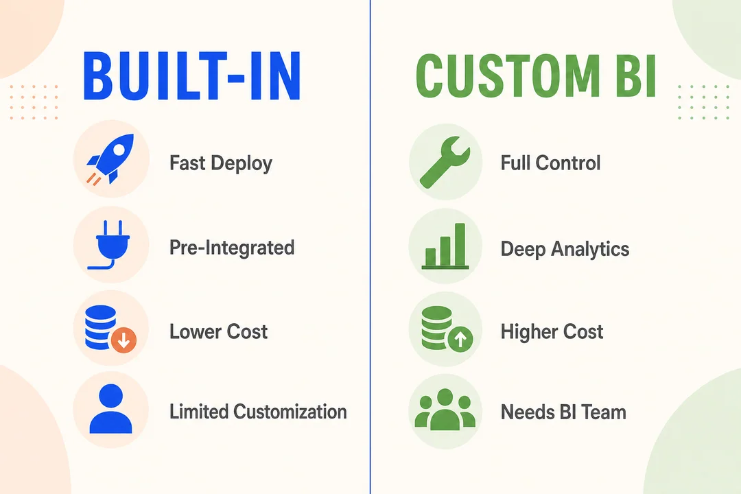
When built-in dashboards are the better fit
Built-in dashboards are usually the better choice for SMB and mid-market teams. They are faster to deploy, easier to use, and require less technical support.
They work well when you need:
- Fast setup
- Standard KPI visibility
- Self-service reporting
- Lower maintenance
- Easier adoption for managers
For mainstream teams, this is often the best starting point.
When custom BI dashboards make sense
Custom BI dashboards make more sense when enterprise teams need complex reporting across departments or custom data models.
They can help when:
- You need cross-functional reporting
- You combine data from many systems
- You have internal BI resources
- Standard dashboards are too limited
The trade-off is more setup time, more maintenance, and greater dependency on specialists.
Trade-offs in cost, speed, and usability
| Factor | Built-In Dashboards | Custom BI Dashboards |
|---|---|---|
| Setup speed | Fast | Slower |
| Ease of use | High | Varies |
| Customization | Moderate | High |
| Maintenance | Low | Higher |
| IT dependency | Low | Higher |
| Cost structure | Usually simpler | Often higher total cost |
For most buyers, built-in dashboards are the better fit unless reporting needs are unusually complex. They get teams to value faster and reduce operational friction.
Best Call Center Dashboard Software Options to Consider
Named tools commonly used for call center dashboards
The SERP for call center dashboard software typically names these platforms. Start from this shortlist and validate against your stack.
- Five9 Performance Dashboards: Best for teams already on Five9 that want native real-time dashboards.
- NICE CXone Dashboards: Best for enterprises that need deep analytics with workforce optimization.
- Talkdesk Live: Best for cloud contact centers that need real-time wallboards and supervisor views.
- RingCentral Analytics: Best for teams on RingCentral that want unified phone and contact center reporting.
- Genesys Cloud CX Dashboards: Best for omnichannel contact centers needing flexible custom views.
- Klipfolio or Geckoboard: Best for teams that pipe call center data into a flexible BI dashboard layer.
What to compare before shortlisting tools
Before you book demos, compare tools on the basics that affect day-to-day use:
- Real-time data accuracy
- Reporting depth
- Omnichannel visibility
- AI features
- Integration coverage
- Ease of use
- Pricing transparency
- Setup time
- Customer support
- Security and compliance
These are the areas that usually separate a good demo from a good long-term fit.
Top 7 call center dashboard software options
Aircall
Best for: small to mid-sized teams that want fast setup and simple dashboards.
Key strengths: Aircall is known for quick deployment, user-friendly dashboards, and a strong integration ecosystem. It is often a practical fit for teams that want live visibility without a heavy enterprise rollout.
Possible drawbacks: It may not be the best fit for highly complex enterprise environments with broader workforce or reporting needs.
Ideal team size/use case: SMBs and mid-market support or sales teams that value ease of use and fast adoption.
Dialpad
Best for: teams that want a modern interface and AI-led workflows.
Key strengths: Dialpad offers a clean UI, useful live visibility, and strong interest in AI-driven features such as transcriptions and summaries.
Possible drawbacks: Reporting depth and advanced dashboard flexibility should be validated based on your exact use case and plan.
Ideal team size/use case: growing teams that want simple adoption, modern workflows, and built-in AI support.
NICE CXone
Best for: enterprise contact centers with complex omnichannel and workforce needs.
Key strengths: NICE CXone has strong enterprise depth, broad omnichannel support, and a larger WFO/WFM ecosystem (workforce optimization and workforce management).
Possible drawbacks: Cost and complexity can be significant for smaller teams or buyers that only need core dashboards.
Ideal team size/use case: large operations with complex compliance, routing, and staffing requirements.
Genesys
Best for: large or complex CX operations that need scale and omnichannel support.
Key strengths: Genesys is a scalable platform with strong enterprise functionality and broad support for omnichannel customer journeys.
Possible drawbacks: Implementation and learning curve can be steeper than lighter-weight platforms.
Ideal team size/use case: enterprises with advanced workflows and more mature operations teams.
Five9
Best for: teams that want a mature cloud contact center with solid reporting and routing.
Key strengths: Five9 is a well-known cloud contact center platform with good analytics and routing capabilities.
Possible drawbacks: It can feel heavier than necessary for smaller teams looking for simple dashboard software.
Ideal team size/use case: mid-market and enterprise teams that want a more established contact center platform.
Talkdesk
Best for: teams that want modern cloud workflows with automation support.
Key strengths: Talkdesk is often seen as user-friendly and flexible, with strong support for cloud contact center workflows and omnichannel use cases.
Possible drawbacks: Feature value can depend on package tier, so buyers should confirm what is included versus extra-cost.
Ideal team size/use case: growing and mid-sized teams that want a modern platform without going fully enterprise-heavy.
Calabrio ONE
Best for: teams focused on workforce optimization, analytics, QA, and coaching-heavy environments.
Key strengths: Calabrio ONE is strong in performance visibility tied to QA and workforce management workflows.
Possible drawbacks: It may exceed the needs of buyers who only want basic live dashboards and standard KPI reporting.
Ideal team size/use case: larger support environments with strong quality and staffing requirements.
A simple comparison framework readers can use
Shortlist tools by use case, not by feature count alone.
| Category | Tools to Consider |
|---|---|
| Best for small business | Aircall, Dialpad |
| Best for mid-market growth | Talkdesk, Five9 |
| Best for enterprise | NICE CXone, Genesys |
| Best for AI-focused workflows | Dialpad, Talkdesk |
| Best for omnichannel complexity | NICE CXone, Genesys |
| Best for coaching and performance workflows | Calabrio ONE, NICE CXone |
Use this as a starting point only. Final fit depends on your channels, team size, integrations, and budget.
How to Choose the Right Call Center Dashboard Software
Start with your team size and primary use case
Start with what your team actually needs.
- Support teams need queue health, service levels, FCR, and CSAT.
- Sales teams need response speed, connect rate, and outcomes.
- Blended teams need both service and revenue visibility.
- Remote teams need clear live status and simple role-based dashboards.
- Omnichannel teams need visibility across voice, chat, email, and SMS.
This prevents overbuying. Many teams pay for advanced features they rarely use because they never defined the main use case first.
Check whether the data is truly real-time
Not all dashboards update at the same speed. Some are live. Others refresh with delays.
Ask vendors:
- Which metrics update instantly?
- Which metrics refresh every few minutes?
- Are alerts based on live or delayed data?
- Does queue status reflect current conditions?
If your team needs live queue decisions, refresh frequency matters a lot.
Evaluate ease of use for managers and agents
A dashboard only helps if people actually use it.
Check for:
- Clear layouts
- Low click depth
- Easy widget customization
- Simple self-service reporting
- Fast access to agent and queue views
If managers need analysts to build every view, adoption will suffer.
Review integration depth across your stack
Look beyond the integration logo list. Ask how the integration actually works.
Review:
- CRM integration
- Help desk sync
- CCaaS connection
- QA tools
- WFM tools
- BI export options
Also ask whether the integration is:
- Native
- Read-only
- Bidirectional
- Limited by plan
- Add-on priced
That detail affects both cost and reporting quality.
Consider scalability, compliance, and security
This matters more as teams grow or operate in regulated industries.
Check for:
- Role-based permissions
- Data retention controls
- Audit visibility
- Security expectations
- Support for compliance requirements
You do not need deep technical detail here, but you do need confidence that the platform can grow with your team.
Compare pricing models and hidden costs
Entry pricing rarely tells the full story.
Review the total cost of:
- User licenses
- Advanced reporting tiers
- AI modules
- Integrations
- Implementation fees
- Training
- Premium support packages
A cheaper starting price can become expensive if key reporting features are locked behind upgrades.
Use a shortlist checklist before booking demos
Use this checklist to narrow your options:
- Define your top 5 KPIs.
- Identify your primary use case: support, sales, blended, or omnichannel.
- Confirm which dashboards are live versus delayed.
- List the integrations you must have.
- Check whether role-based dashboards are included.
- Ask what reporting features cost extra.
- Confirm whether alerts are customizable.
- Review how easy it is to build and share dashboards.
- Check support, onboarding, and setup time.
- Make sure the demo shows your real workflow, not just generic features.
This step helps you avoid polished demos that do not match daily operational needs.
Signs Your Team Has Outgrown Spreadsheets or Basic Reports
Reporting takes too long
If managers spend too much time exporting and cleaning reports, your process is already too manual. This matters because reporting delay leads to slower decisions. It usually signals that the team needs centralized, easier dashboard visibility.
Managers cannot spot issues until after service levels drop
If service problems are only obvious after the shift ends, you lack live visibility. That matters because recovery is always harder after the damage is done. It signals a need for real-time monitoring and alerts.
KPI tracking is inconsistent across teams
If support, sales, and operations use different definitions or report different numbers, trust in the data drops. That matters because teams start debating metrics instead of solving problems. It often signals disconnected systems and weak dashboard standardization.
Data from phone, CRM, and support tools does not match
When core systems disagree, managers cannot rely on reports. That creates delays, rework, and confusion. It usually signals the need for better integrations and a more unified reporting layer.
Common Mistakes to Avoid When Using Dashboard Software
Tracking too many metrics at once
The mistake: putting every available KPI on one screen.
The consequence: clutter, slower decisions, and low adoption.
The fix: focus each dashboard on the few metrics tied to that role’s decisions.
Focusing on AHT without balancing CSAT and FCR
The mistake: treating low handle time as the main goal.
The consequence: agents rush calls, customers call back, and satisfaction drops.
The fix: track AHT, CSAT, and FCR together so speed does not overpower quality.
Ignoring role-based dashboard needs
The mistake: giving every user the same dashboard.
The consequence: agents see too much noise, executives see too much detail, and supervisors still need separate reports.
The fix: tailor views by role and decision-making need.
Treating dashboards as reports instead of decision tools
The mistake: using dashboards only to review what already happened.
The consequence: teams miss the biggest value, which is live action.
The fix: build workflows around alerts, queue monitoring, coaching, and same-day response.
Frequently Asked Questions
What is call center dashboard software?
Call center dashboard software is a tool that displays real-time and historical contact center KPIs in one place. It helps teams monitor queues, agent activity, service levels, and customer outcomes faster.
What metrics should a call center dashboard include?
A useful call center metrics dashboard should usually include:
- ASA
- AHT
- Service level
- Abandonment rate
- CSAT
- FCR
- Call volume
- Agent availability
The best mix depends on whether your team is focused on support, sales, or both.
Is call center dashboard software only for large contact centers?
No. Small and mid-sized teams can benefit a lot from dashboard software. It helps them monitor operations more easily, reduce manual reporting, and coach agents without needing a large analytics team.
What is the difference between a call center dashboard and a reporting tool?
A dashboard is built for live visibility and faster action. A reporting tool is usually built for delayed review and summary.
In short:
- Dashboard: monitor and act
- Report: review and analyze later
What is the difference between dashboard software and performance management software?
Dashboard software focuses on KPI visibility and monitoring. Performance management software is broader and may include QA, coaching workflows, WFM, and other structured improvement tools.
What should small businesses look for in call center dashboard software?
Small businesses should usually prioritize:
- Ease of use
- Real-time core KPI tracking
- Native integrations
- Transparent pricing
- Fast setup
- Simple dashboard customization
Those basics matter more than advanced AI for most smaller teams.
Conclusion
The best call center dashboard software gives teams clear real-time visibility, practical KPI tracking, and useful reporting without adding unnecessary complexity. For most buyers, the priorities are simple: accurate live data, easy-to-use dashboards, strong integrations, and pricing that stays predictable as needs grow.
Before you buy, define your must-have KPIs, shortlist tools by use case, and book demos that reflect your real workflows. That will help you compare vendors with more confidence and choose a platform your team will actually use.
More in Operations & CX Optimization
View all →
Customer Experience Transformation: Framework and Steps
A telecom customer calls support about a billing error. They explain the problem to the IVR system. Then to the first agent. Then get transferred and explain again. Then escalated—and explain a third time. Forty minutes later, they're exhausted and the problem still isn't solved. This is what broken customer experience looks like. And it's costing you customers. Customer experience…


Web Caller Meaning: JavaScript caller, Calling Tools or Portals
“Web caller” is one of those phrases where the search results and the searcher are frequently talking about different things. Three unrelated audiences use it: developers hitting an error on the legacy JavaScript caller property, buyers evaluating browser-based calling software, and people trying to reach a specific portal or training page whose exact name they cannot recall. That fragmentation is…

Customer Experience Strategy: How to Build One That Works
Customer experience is getting worse, not better. Forrester's 2025 Global CX Index found that 21% of brands declined in CX quality while only 6% improved — and in the US, 25% declined against 7% that improved, the second consecutive year of that pattern. Most of those brands were not neglecting customer experience. They were working on it without a strategy…



 English
  Russian
  Chinese